Friday, March 4, 2011

Week 10!

Well, what do you know! Here we are, it is week 10. It has been quite a quarter indeed. From snow weeks, to me being a cripple and in crutches for 10 days (thank you to all of you for being so helpful!) to gaining inspiration from the simplest things and turning it into a...6FT TALL MODULAR POD! I have definitely grown as an aspiring designer and gained so much from Professor Robinson. These were definitely lessons to keep in mind and incorporate in every future project. 


This blog has been a pleasing assignment, I have thoroughly enjoyed analyzing Architecture and Interior Design in ways I would not have thought of. It has opened my eyes to the world around me, which will never be the same again! The vocabulary are words I will continue to use in order to explain my concepts and ideas. 


It has been an amazing quarter, but it is not over yet as now it is time to build what we have all been waiting for. Our living pods......

Wednesday, March 2, 2011

Chapter IV: Proportion and Scale

This week's post is on The Theories of Proportion.
The relationships of a room's proportion and scale plays a huge role in order to make a place feel like everything relates to one other. Only then can you get a sense of harmony within the spaces.


GOLDEN SECTION
This mathematical proportion method has been in existence since the days of the Greeks and Renaissance architects. It may be a hard concept to grasp, but the sentence that best simplifies the Golden Section is that it is the two dimensions of a plane figure. For those who think mathematically, it is a/b = b/a+b. it can also be said that this is the ratio between two sections of a line. 


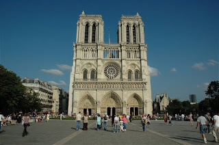
The Notre Dame in Paris can be seen as having the Golden Section in a way that  the two rectangles on both sides are proportional to each other. This may also be called the Golden Rectangle! It becomes additive and progresses, starting from the top square. It may go on indefinitely, as long as all parts remain similar in proportions. The way I see this, each horizontal line begins where a new architectural element begins, such as the windows.


                           http://www.visitingdc.com/paris/notre-dame-cathedral-paris-france.asp


THE ORDERS
This theory of proportion was invented and first used by the Greeks, and they called it The Orders of Classical Architecture. These orders are known as Tuscan, Doric, Ionic, Corinthian and the least known, Composite. These are in hierarchal order, shortest to tallest. All are made in a certain order, beginning with the base, shaft and the capital, which may be plain or ornamented. The idea of the classical orders were so that all parts of the building were proportionate to one another. 


The Trevi Fountain in Italy consists of Corinthian columns, some of which are in a compositional order, such as foreground and background. 


                                           http://romeitaly.ca/attractions/trevifountain.html

RENAISSANCE THEORIES
This theory refers back to Renaissance artists in Italy. They believed that their architecture should belong to a higher power and focused on the Greek mathematical system of proportions. Therefore they used math and related it to spacial units. They used Pythagoras to measure their spaces. 


This classical church floor plan demonstrates the Renaissance Theory of spacial units that are harmonious and proportionate to each other. The emphasis becomes the bigger space in the front, which can be seen as the high order in this floor plan.


http://www.sacredarchitecture.org/articles/awe_for_the_noble_things_leon_battista_alberti_and_the_meaning_of_classical/


THE MODULAR
This system was created by Le Corbusier, and is based on The Golden Section. He saw the Greeks and Egyptian methods to be very helpful and therefore based his proportioning system on mathematics and the proportions of a human body. This was a book he published. The modular is still in use in today's architecture and is based around the theory of harmonious measurements that suit the human body.


Below is Corbusier's human scale. The Weissenhof house's ribbon windows are reflective of his proportioning method as they allows enough space for the human body to look out. 


http://www.irvinehousingblog.com/forums/viewthread/3050/


THE "KEN"
The Ken is a unit of measure used by the Japanese and is similar to the English foot measuring system. The Ken started off in the Middle Ages and was used to designate intervals of two columns, but later on became the standardized rule of proportions and measurement for residential architecture. It varies with the sizes of the building. 


One of the methods of The Ken is based on the floor mats in a room, this is called the Kyo-ma method. The diagram below shows how the mat on the floor is proportional to the wall structure surrounding it and vice versa. 

http://www.designshoot.com/uploads/desember-08/japanese-room-2.jpg


ANTHROPOMORPHIC
Anthropometric refers  to the measurements of the size and proportions of the  human body for the sole purpose of understanding physical variation. There are different ranges, from petite to tallest, they all have different needs and averages. Therefore, Anthropomorphic, is best understood as the measurements of the size and proportions of the human body. Having an in-depth understanding of this helps designers with proportions and spaces between furniture, interior spaces or just personal space. Having this knowledge, helps better determine dimensions of anything related to design.

The red lines in the image below is the man, while the red signifies the height of the table, chair and computer screen. They depict how the anthropometrics are valid as the relationship between human and objects relate and work together.


                     http://www.microsoft.com/athome/images/tiptalk/HCG_Illust01.jpg


SCALE
Scale and Proportion are what is mostly confused. Scale refers to the comparision of sizes between an object and it's relation to something else, such as its surroundings. Proportion is in relation to the actual thing itself.  This is important in design as it plays a big role in it's function and aesthetics. Scale and anthropometric proportioning determines the scale of designs such as buildings, interior spaces or furniture.


The scale of the sculptural steel beam by artist Anish Kapoor is enormous in relation to the average human and even buildings that may be thin in width/depth. This is displayed in Chicago.


                                           http://www.cirrusimage.com/chicago/100_3259.JPG


Friday, February 11, 2011

Chapter III: Form & Space


Welcome to the third week of blogging! Here's a quote to help you with what we're learning....

"The elements of form and space together, form the reality of architecture" - Francis D K Ching


FORM AND SPACE: THE UNITY OF OPPOSITES
Form and Space are created by positive and negative elements. This depends on our perception of what we are looking at. Form is what is clearly defined. In other words, form is what takes up mass. They are the walls and planes of a particular area. While space helps mould the area simply by being the area around it. A space can be viewed as the positive area, the form becomes the negative area....or they can be switched!

   The Farnsworth House is an example of form and space being united, despite its' opposites. The actual house takes up form, the vertical plane and pilotis help define these. Therefore, the empty area surrounding it becomes what is known as space. Form and Space!


http://www.lab404.com/creativity/images/farnsworth_house.html


  DEFINING SPACE WITH HORIZONTAL ELEMENTS: THE OVERHEAD SPACE
   Horizontal elements are planes with bases. There is the base that's situated on  the ground, an elevated base, a depressed base and an overhead plane.

   When I think of bases, Frank Lloyd Wright's Prairie style homes come to mind. Specifically the Robie House. This house has an overhead plane, which so happens to be a characteristic of the Prairie Style. The hanging roof can also be called a cantilever.      

   An overhead plane is horizontal and defines the volume underneath it, between the overhead plane and it's ground plane.


http://commons.wikimedia.org/wiki/File:Robie_House.jpg

DEFINING SPACE WITH VERTICAL LINEAR ELEMENTS: PARALLEL PLANES
  These type of planes define the volume between them. Parallel planes distinguish a strong direction as they never meet, but somehow point towards a space. This then directs the spacial movement of people within the space. These planes also act as structural support for what is above them, such as the roof. 

   The interior parallel planes of St Peter's Basilica lead visitors towards the sculptural element. 


QUALITIES OF ARCHITECTURAL SPACE: LIGHT
   Natural light is a very important architectural and interior aspect in every living space. Light is necessary at all costs. Natural light, is an amazing part of nature and this needs to be present in every design. Where windows are located are important as we need to think of the direction natural sunlight comes from. 

   Have you ever heard of the invisible glass house located in Sweden? It is made up of glass, therefore it is full of natural light...as long as the sun is out! This is an amazing architectural example of a very important quality of design. 


http://www.crazyjunkyard.com/wp-content/uploads/2009/06/invisible-treehouse-hotel.jpg

  DEFINING SPACE WITH  HORIZONTAL ELEMENTS: THE OVERHEAD SPACE
  Just like windows let natural light in, openings in spaces exist to create enclosures, as without enclosing planes, visual continuity is impossible. Openings, such as negative doorways, hallways or windows, can be placed at corners, on a  plane, or even between planes. 

   The designers of this kitchen has placed openings at the corners of the kitchen, letting light shine through to the sink and possibly towards the other end of the kitchen, depending on how strong the light rays are. This is also well space-planned as the stoves are close by, therefore any smell can go out through these corner windows.


http://aspenremodelers.com/wp-content/gallery/bloomington-kitchen-expansion/bloomington-kitchen-custom.jpeg

Monday, February 7, 2011

Chapter II: Form


Architecture and Interior Design is made up of forms....and spaces! Theses shapes become manipulated and turn into buildings, furniture, etc. Have a deeper look at what's around you and you may find this to be true. Sometimes we just have to open our eyes more to the spaces around us. 


PRIMARY SOLIDS
Our minds simplify our visual environment so that we may understand it. Therefore, from primary shapes derive numerous composition of forms. From triangles we get cones or pyramids, Squares become cubes and Circles turn into spheres or even cylinders.

This Fabrege Egg building in London, UK is one of my favorites! Who could ever have guessed that an egg could turn into some office building one day. This building derived from a circle and was simply pulled up to create this oval.


                      http://travel.webshots.com/photo/1438924024067003834JSjVWa


DIMENSIONAL TRANSFORMATION
When the dimensions of a certain form have been changed, it undergoes a dimensional transformation. Areas can be subtracted or added, height and width could be shortened or pulled, but we can still identify the form.

In this picture, I have used The Emirates Towers as an example. They are elongated rectangles that are standing vertical. The red highlights depict this. The top has a subtracted area but it is still visible what their primary solid was.


                                                 http://ersoy.org/uae1.htm


SUBTRACTIVE FORMS
This is the process of removing a section of a volume. Also easily recognizable when the alteration has been done, as long as it’s edges and/or corners hasn’t been modified. By subtracting a volume of a form, this gives it a new look.

An excellent example is this unique building known as The Dubai International Financial Center. It is simply a square which transformed into a cube, then a part of it’s middle has been subtracted, therefore it became a subtracted cube! Architecture is so much fun….


http://www.fallingpixel.com/difc-3d-model/6994


ADDITIVE FORMS: CLUSTERS
An additive form is the opposite of a subtractive form. Therefore, it becomes the process of adding one or more sections to a volume. Also easily recognizable.

My example of this is Gehry's Weisman Art Museum. By looking at the 3rd image, it is easily recognizable that Gehry was in fact inspired by cubism! A variety of forms are visible. They have all been added together to this building which was originally rectangular, as the bottom states. However, these additions were slightly modified, but all modifications come from a primary, and these solids can be seen.

http://www.urbika.com/projects/view/2381-weisman-art-museum


     FORMAL COLLISION OF GEOMETRY: CIRCLE AND SQUARE
    There are other collisions of geometry such as rotated grids and edges and corners. However, I am going to teach you about the circle, the square, and how it looks when they mingle! A "formal collision of geometry" is exactly what it is called. This is what happens when two geometrical forms come together, collide and creates a new composite form. 

    During my research for one, I came across a truly unique modern piece of architecture present in Asia. This is the Fangyuan Building, which literally translates to "The Circle and Square Building!" So original! However, if it is looked at as a plane, it is a large coin...with a square in the middle! The architect is the same man famous for designing Taiwain's Taipei 101 building, which was once the world's tallest building...but this superlative now belongs to Dubai, sorry. In my diagrams, I have depicted how this building's geometry has collided into a new form.


http://www.skyscrapercity.com/showthread.php?t=565415&page=23


This concludes this weeks topic on Form! I hope you have enjoyed seeing these wonderful masterpieces and seen beyond just the building!